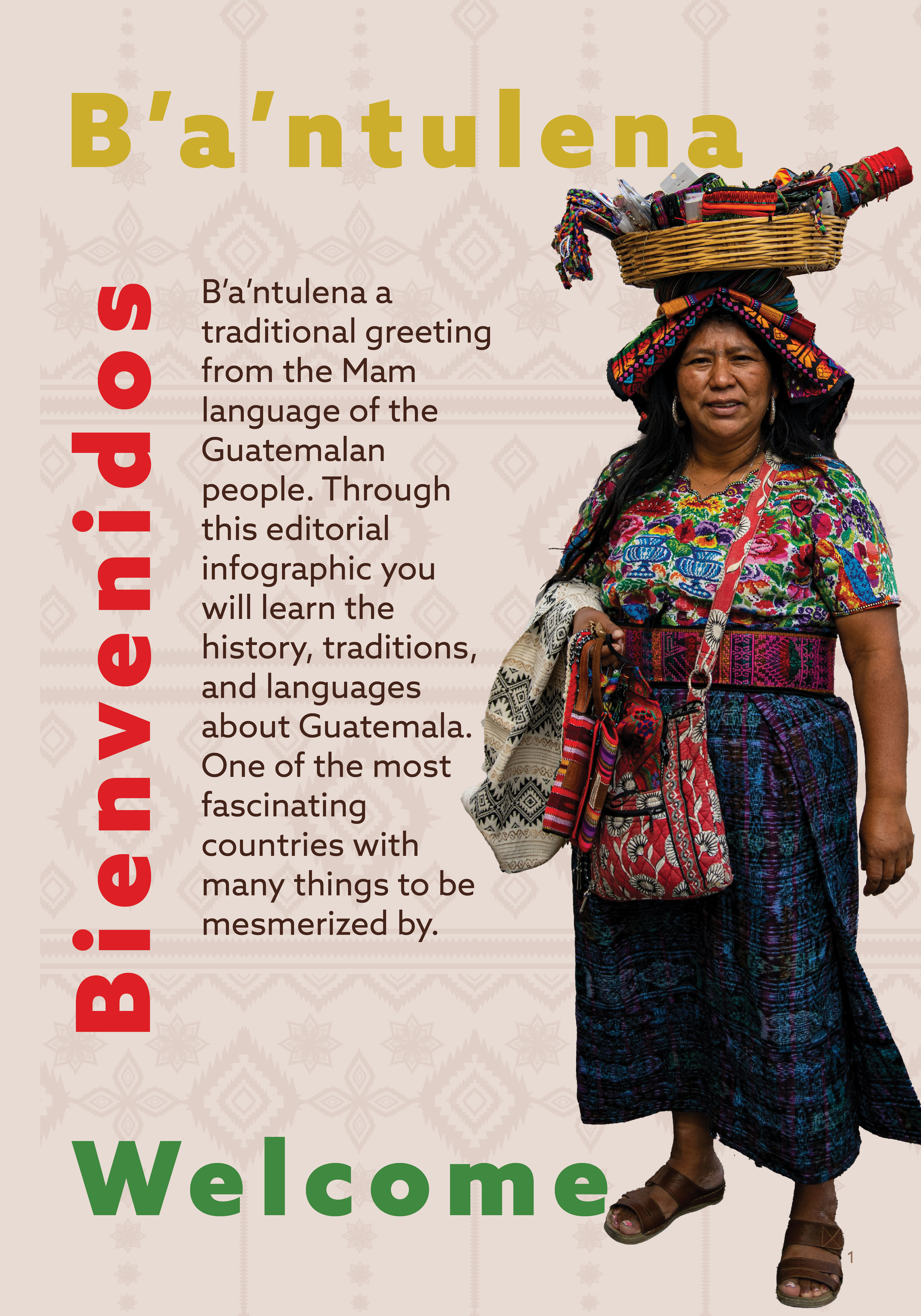
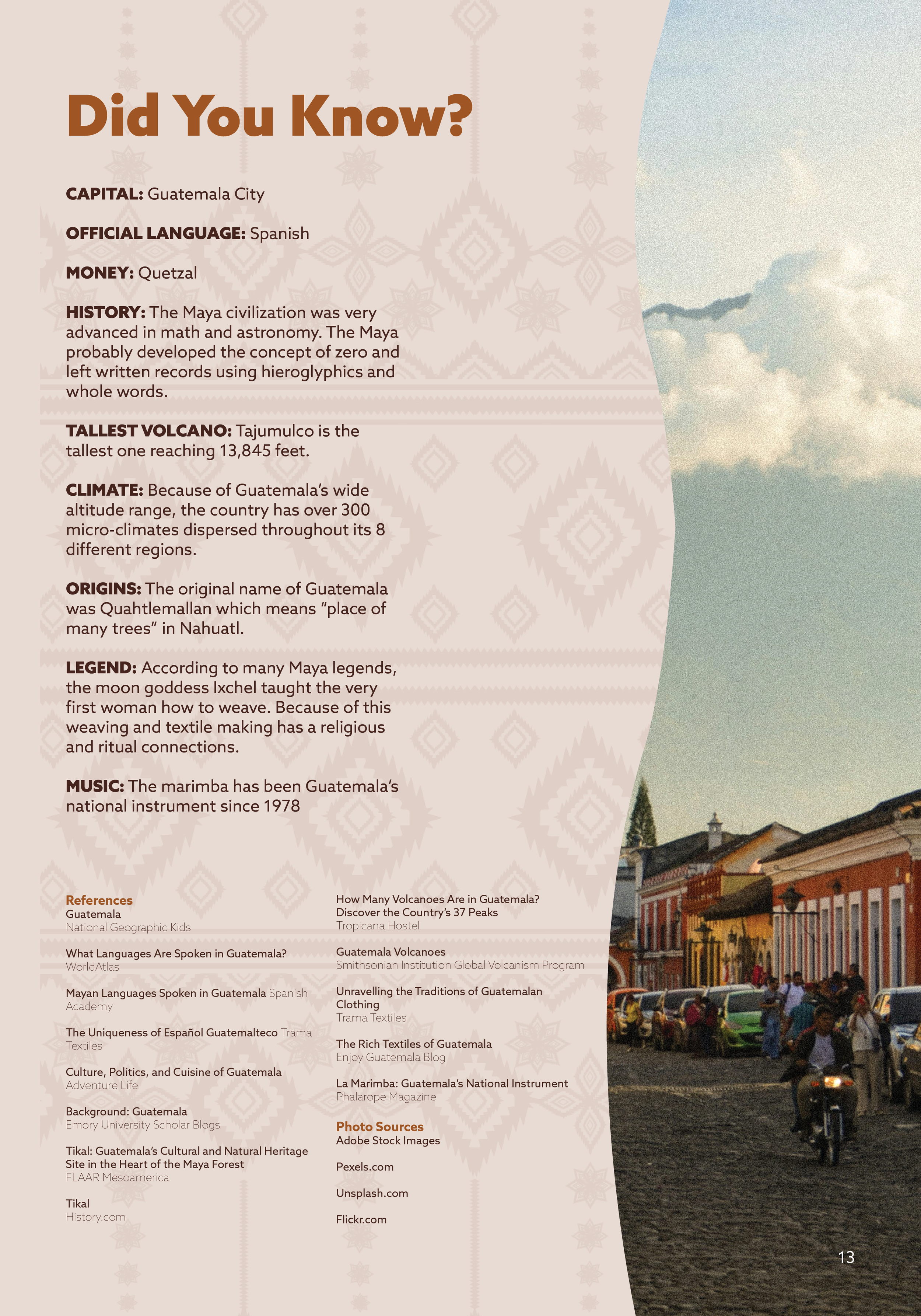
Editorial Infographic
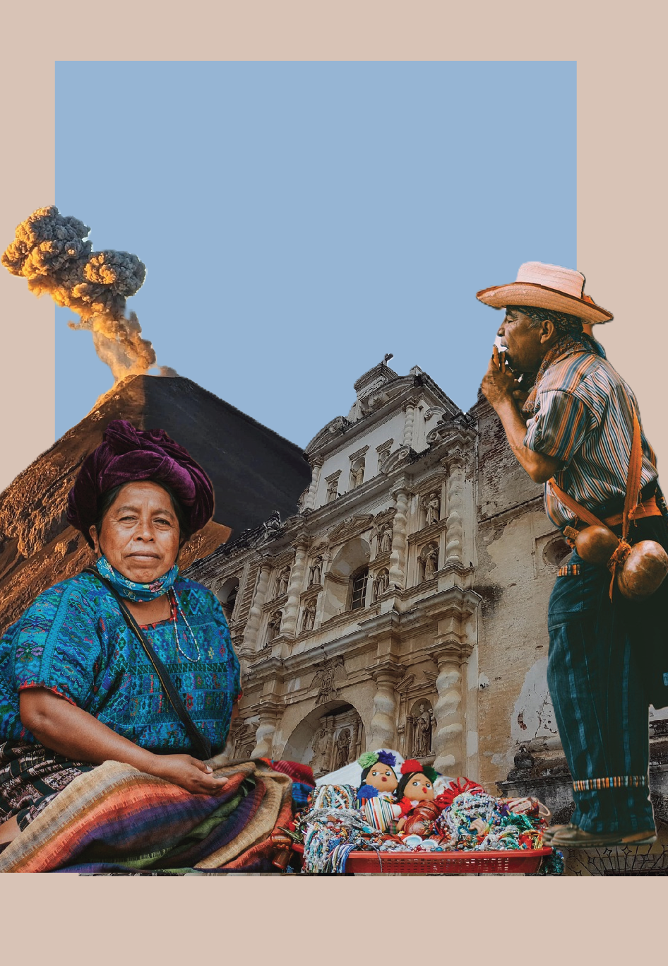
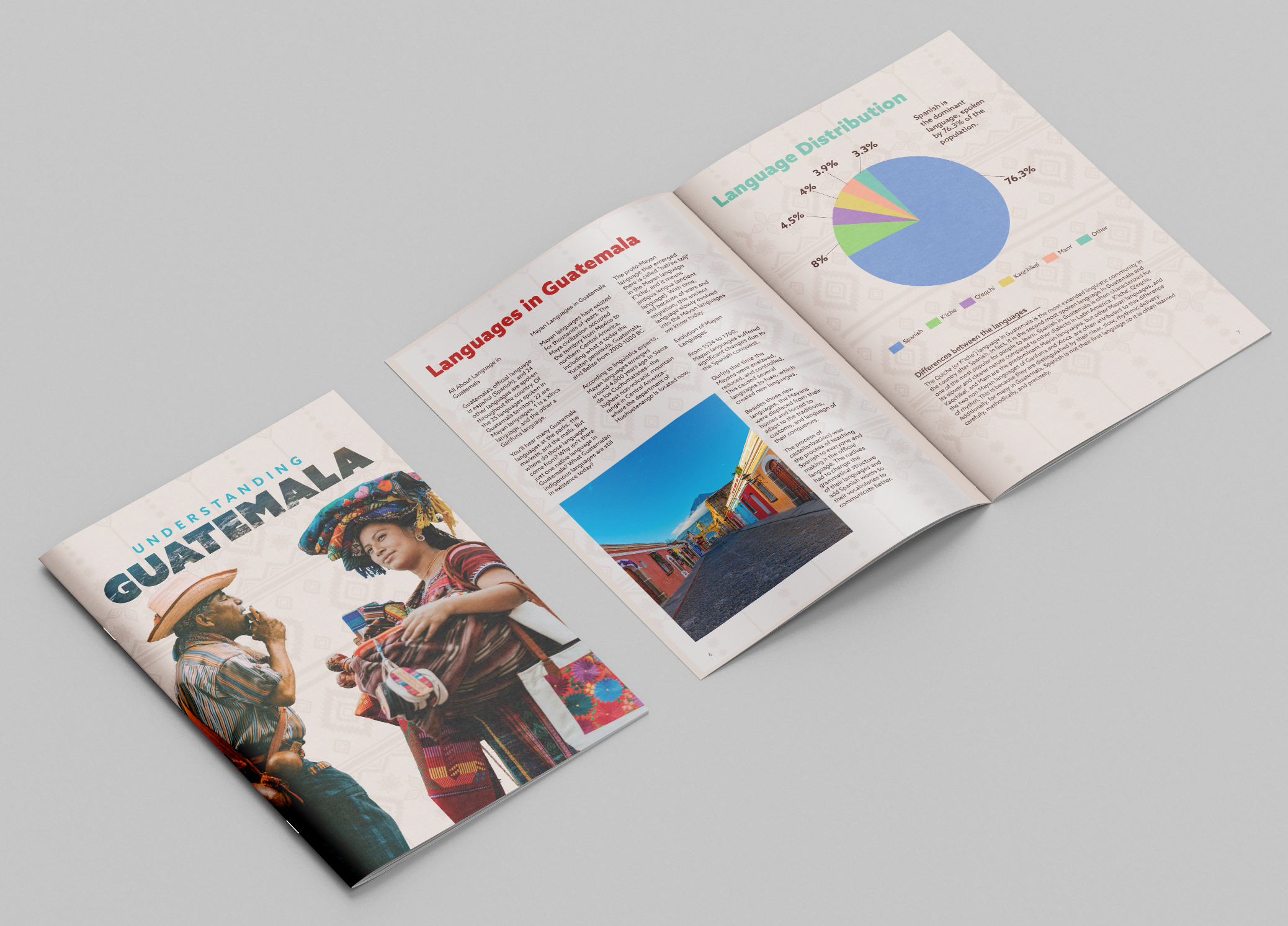
This editorial infographic explores key cultural and geographical aspects of Guatemala through a combination of data visualization and visual storytelling. The project includes a timeline of major volcanic eruptions, a map highlighting the distribution of cultural groups, and charts that present language demographics. My goal was to present complex information in a clear, engaging, and visually cohesive way while maintaining an editorial style suitable for a editorial layout. I focused on creating hierarchy, balance, and readability so that viewers can quickly understand the information while still being drawn into the design.
Through this project, I developed a stronger understanding of how to translate research into effective visual communication. I learned how to structure data using charts and timelines, apply hierarchy through typography, and make design decisions that improve clarity without overwhelming the viewer. I also gained experience working with layout systems and refining details such as alignment, spacing, and consistency. This project strengthened my ability to think critically about both design and information, helping me create work that is not only visually appealing but also informative and purposeful.
Process
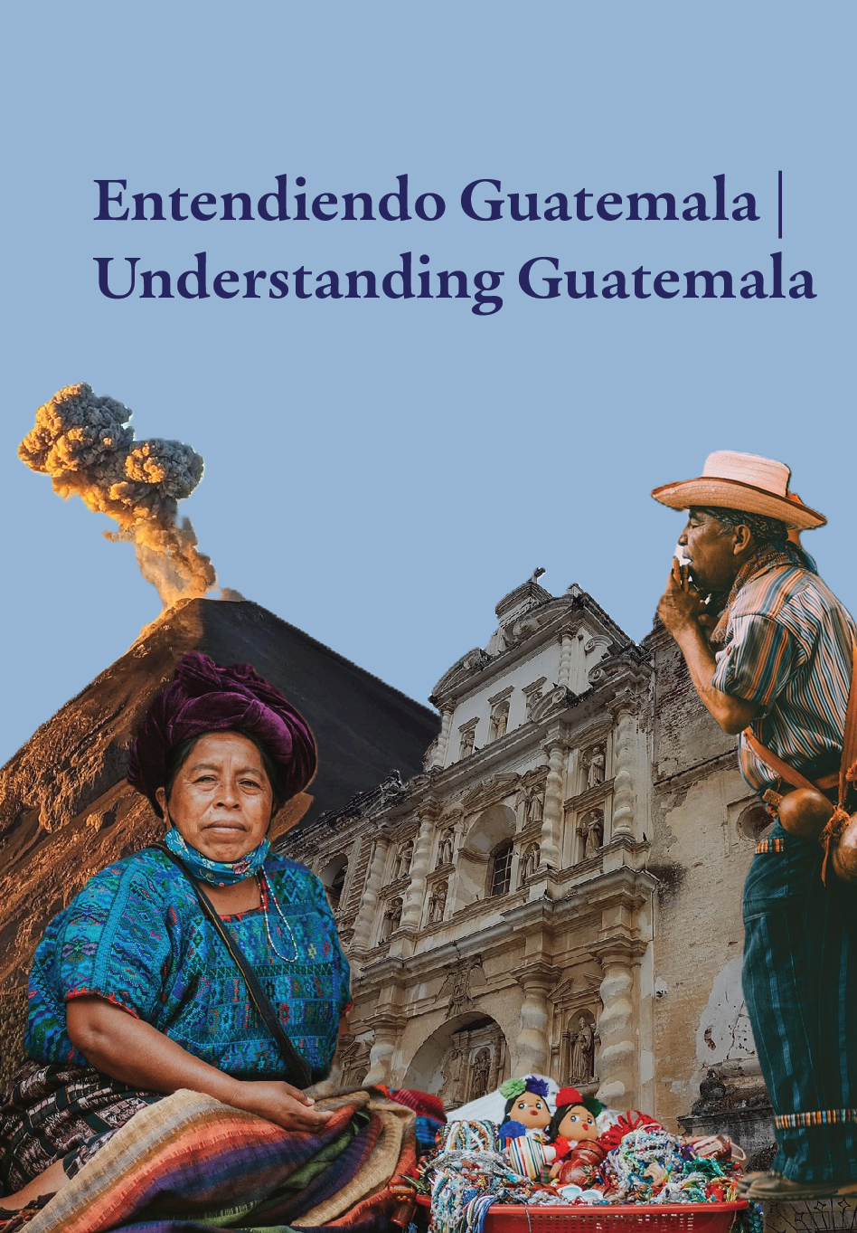
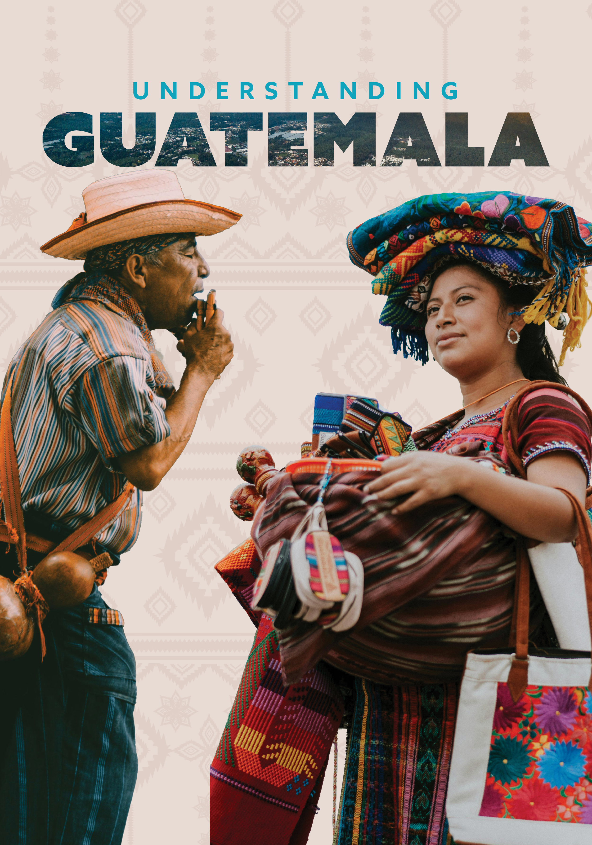
When choosing colors for each page, I pulled them directly from the images themselves to ensure cohesion and create a unified editorial infographic. I researched various magazines and articles discussing the culture, data, and other important information I felt was valuable to include. My end goal was to create layouts and color choices that capture and share a glimpse of the beautiful culture of Guatemala. It was very important to select the right images to reinforce this goal. During the creative process, I sketched multiple layout options, recorded key facts, and collected a variety of reference images.