While redesigning this book, I explored texture, pattern, and movement in a physical form. By making physical alterations to the pages, adding small details, and incorporating cultural artwork, I created a piece that showcases my craftsmanship and use of visual elements. This project strengthened my attention to detail, composition, and material exploration, all of which support my graphic design practice.
The Book of Art
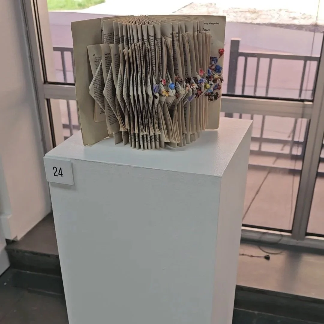
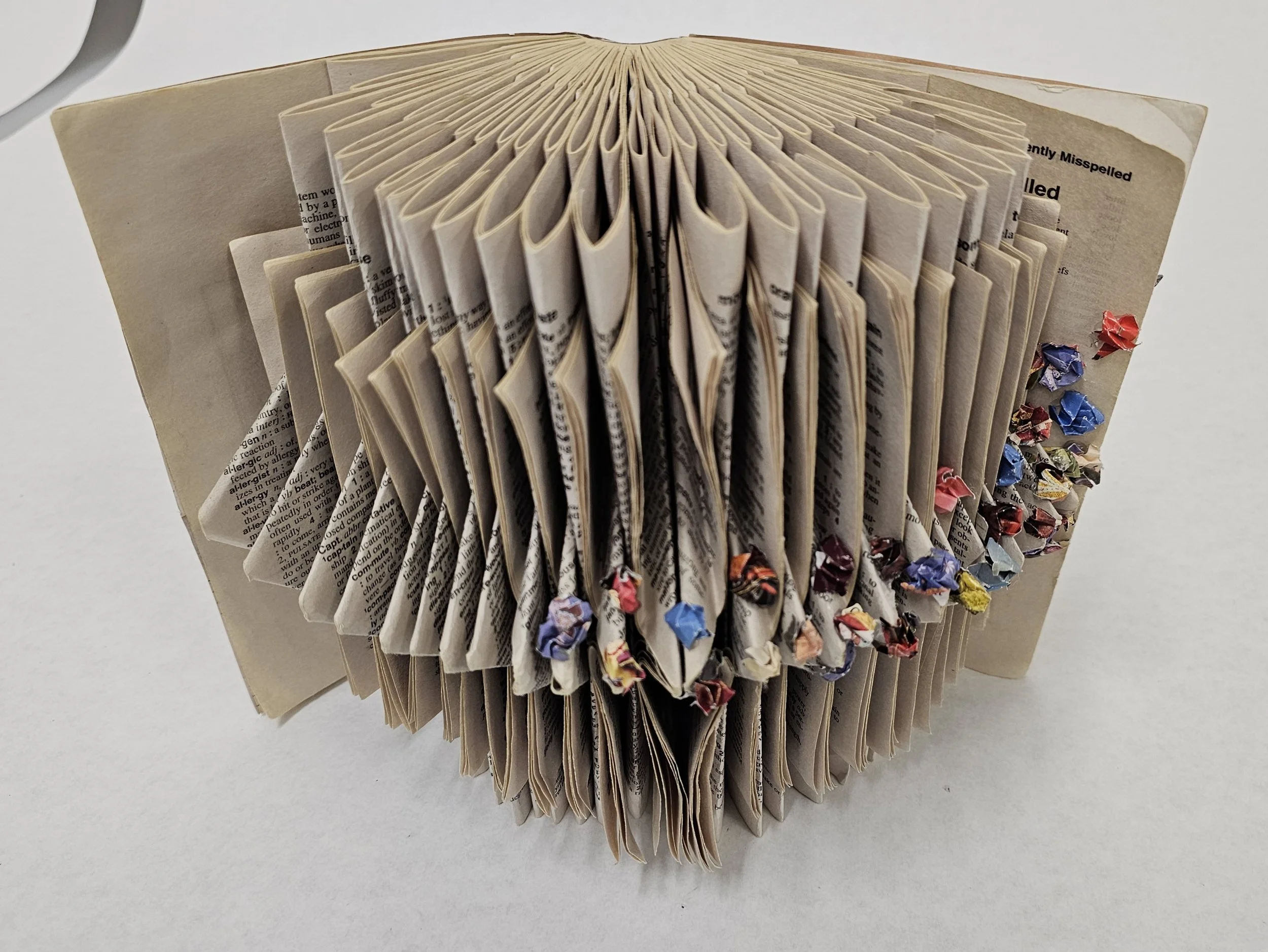
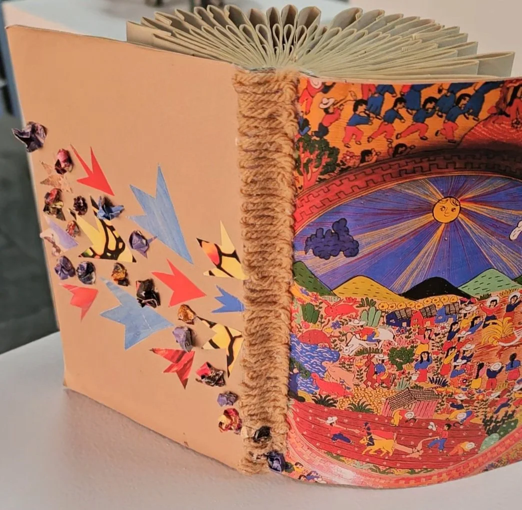
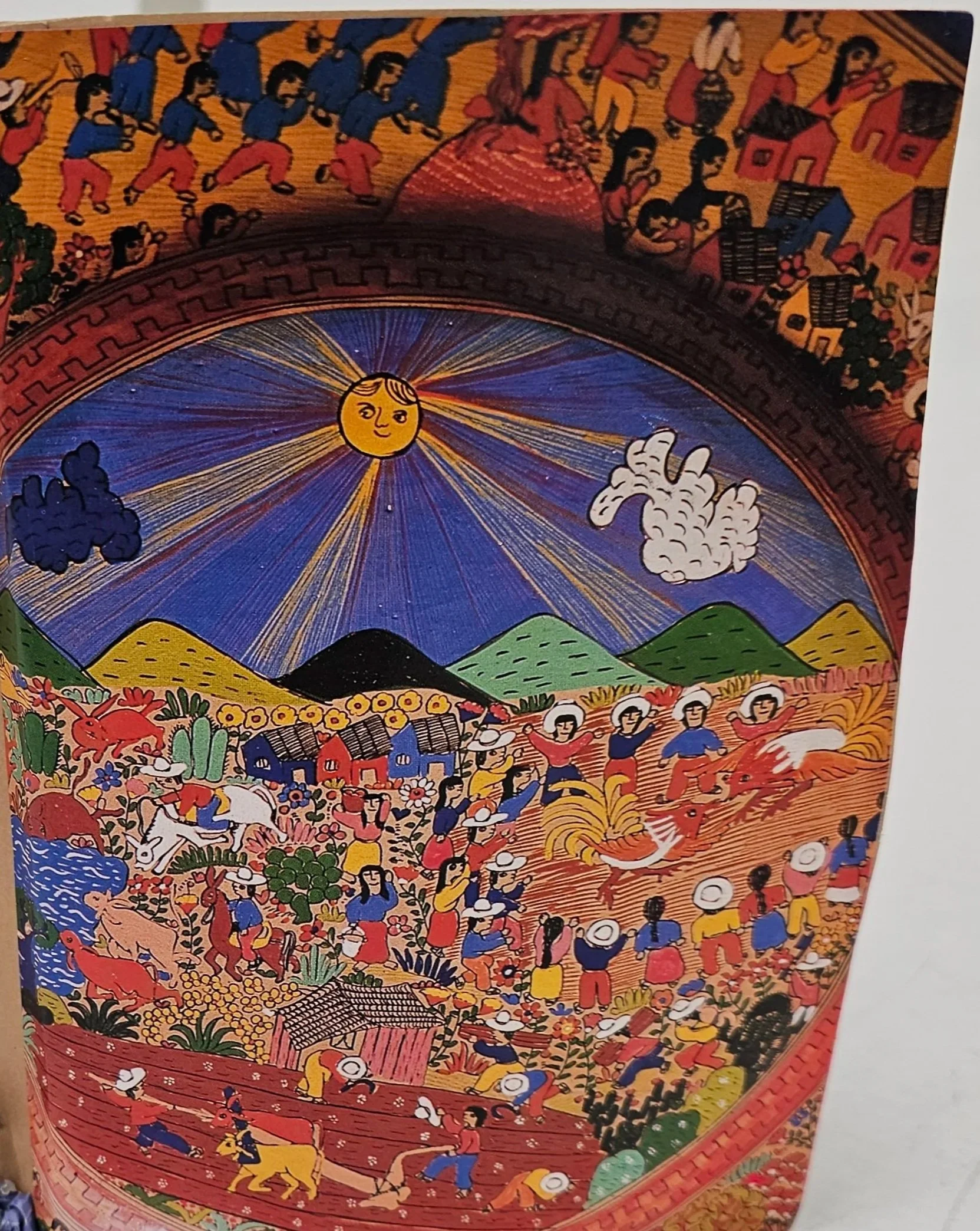
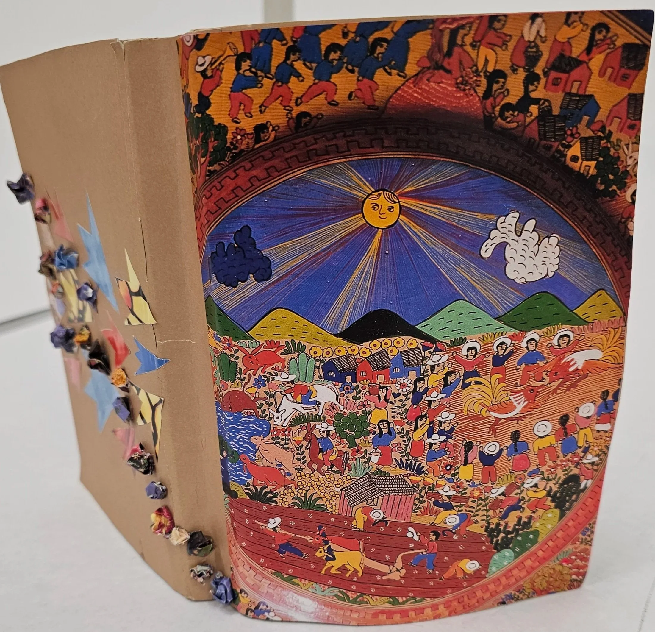
When I chose to fold my pages, I wanted them to feel unique, which is why I decided on the folding technique shown above. I also wanted to incorporate elements of my culture into the design. I visited my local library and explored old magazines, where I found one focused on Mexican art. The featured image is called “Amate,” a form of Mexican folk art painted with vibrant colors that depict everyday life. I chose this image because I was drawn to its rich color palette and intricate details.
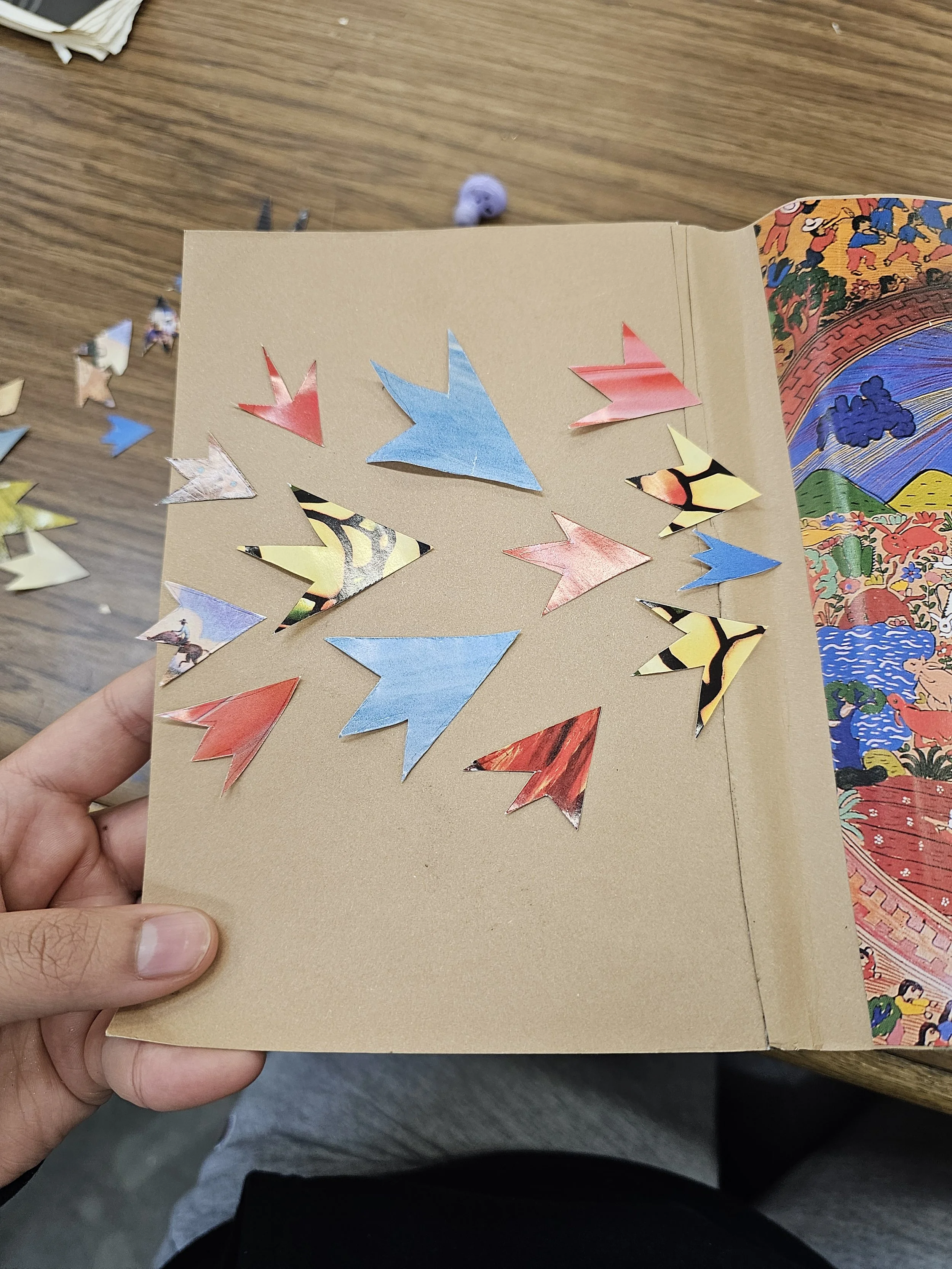
For the images of the arrows and crumpled paper balls, I selected another magazine source featuring stained glass windows. I chose an image with colors that complemented the Mexican folk art. My goal was to create a sense of movement throughout the book, which is why I used crumpled paper starting from the inside and gradually expanding toward the cover. Once it reached the cover, I added arrows and additional crumpled paper to keep the composition visually connected. The arrows were glued down to direct attention toward the main image. I also added tan-colored yarn to introduce another layer of texture and enhance the overall tactile quality of the piece.
Process