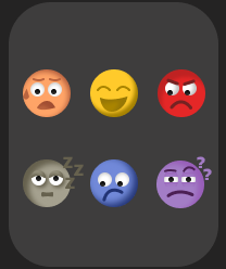
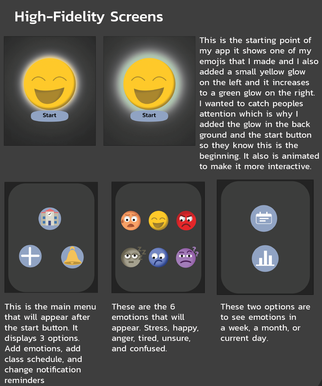
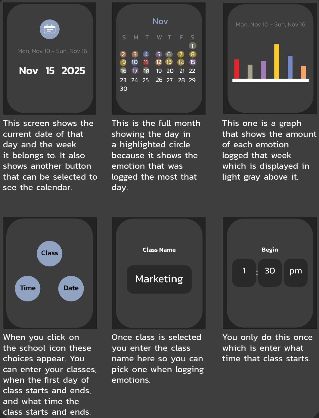
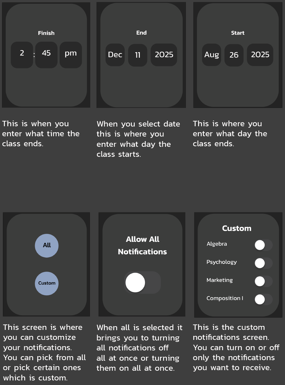
Mood Tracker for Students
This watch app was designed to help students track their mood before and after classes to help them understand how the classes impact them. To keep it easy to use I designed simple icons and a clean layout. My focus was on cleanness and easiness of use, making it easy to log emotions, view mood trends displayed as a graph, and connecting the moods back to classes. Creating this app strengthened my UI/ UX skills, especially in designing for small screens and student focused digital tools.
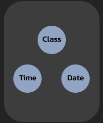
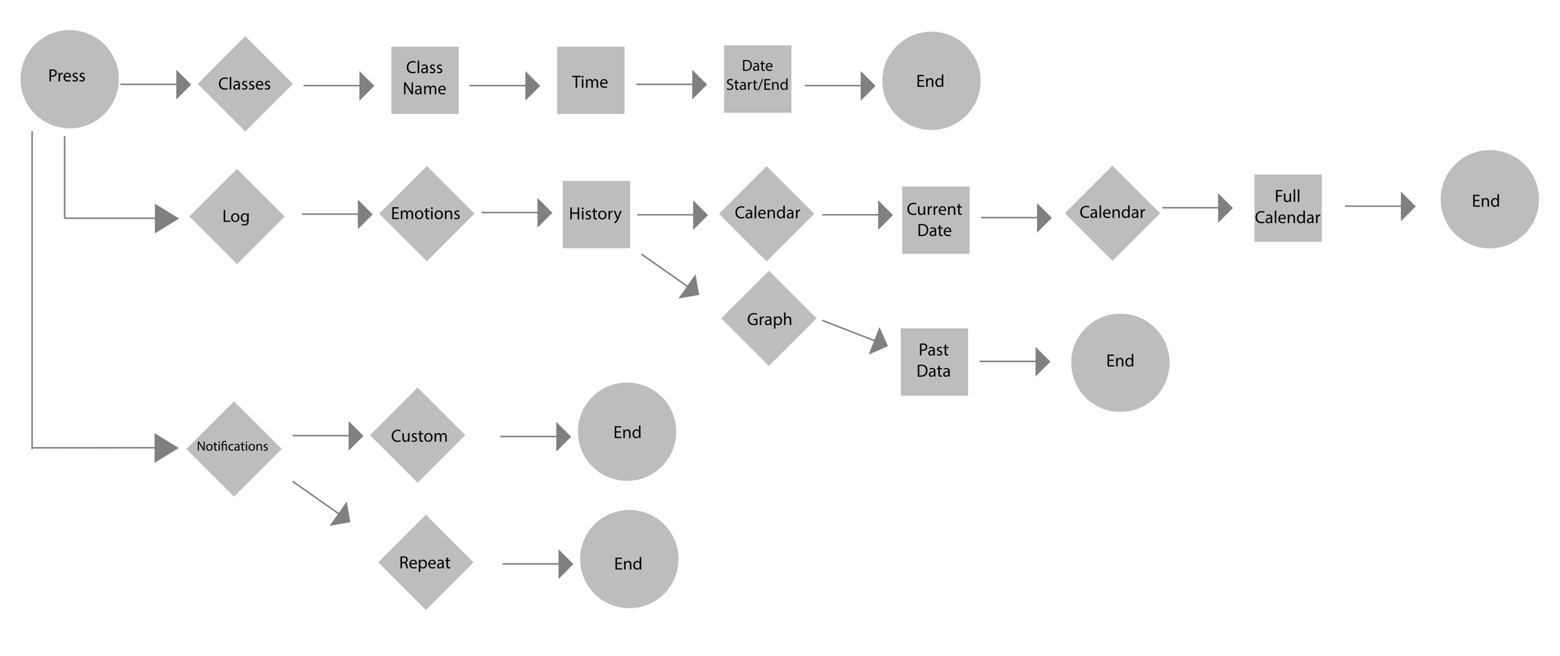
User Flow
I learned how to create a user flow chart. This helped me organize what order my screens were going to go in.
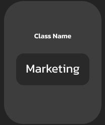
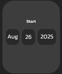
Wire Frames
Created a wire frame for each screen really helped figuring out layout of buttons and what they would like before adding in all my icons, colors, and other elements.

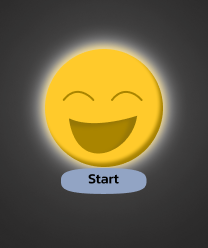
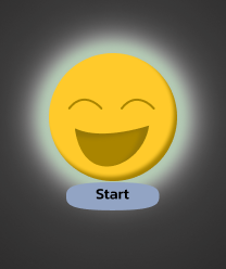
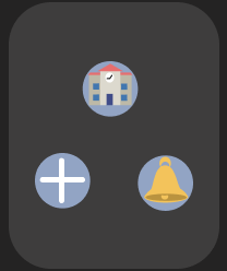
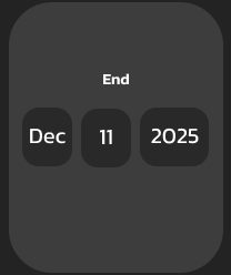
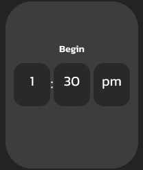
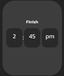
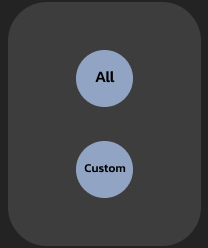
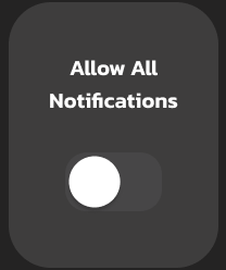
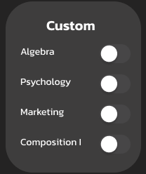
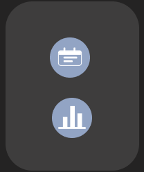
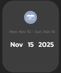
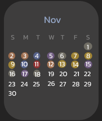
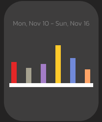
Screen Explanations
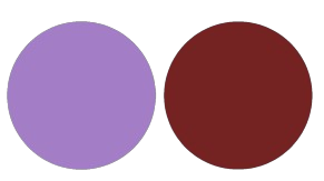
Color Palette
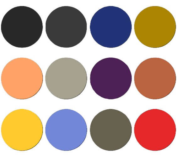
I chose these colors because I believe these are common colors that are related with the emotion as well as using different shades to help make details stand out.
Typography
I chose the font Kanit because I wanted something simple and easy to read for anyone. I used light, regular, medium, and semibold fonts in my app.
Design Style
I wanted my app to give off a modern and simple mood. That is why it is very easy to navigate and have a few choices because students always want something simpler. They do not want something that is overcomplicated or too much. Which is why my app design is easy and fast to use.
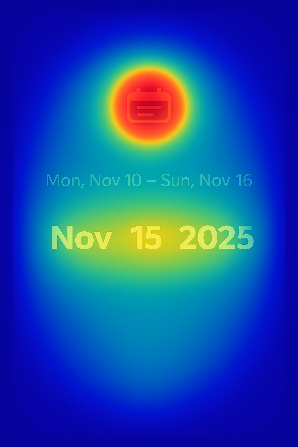
Heatmap Analysis
During this process I also had to learn what a heat map was and I used ai to help me with it. It shows that the calendar button would draw the users attention most which is the goal. I like that they would also focus on the current date because that is why it is bigger. To make the user focus on the current date I could make it a different color so they focus on it as much as the calendar button.